




Your website is often the first thing a stressed-out customer sees before booking a mover. They compare 3 or 4 companies in under 10 minutes.
If your site loads slowly, hides pricing, or buries the phone number, they leave it fast.
Good design isn’t about looking pretty. It’s about giving people the answers they want, right when they want them. Hence, professional moving company website design is no longer optional.
Every element you place on the site should drive traffic closer to booking. This can be clear pricing that builds trust. Or an easy contact form that removes friction. Or real photos and reviews that seal the deal.
When one piece is missing, they’ll call someone else.
9 Website Design Elements That Drive Booked Moves
1. Instant Quote Tool
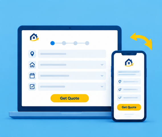
People shopping for movers want a number fast.
A “contact us for pricing” form feels like a dead end to someone comparing five companies at once. An instant or guided quote calculator can fix this. Start with basic move details. Ask for-
- Pickup location
- Home size
- Destination
- Moving date or preferred timeframe
- Selected services
You can also add moving-specific choices, too. Include options for packing, storage, stairs, elevators, and bulky items.
Once a potential client answers those few questions, the tool shows an estimated price right away. Keep the step short. Potential clients shouldn’t complete a twenty-field form before seeing what happens next.
A fast quote keeps visitors on your site rather than sending them to a competitor.
2. Upfront Trust Signals
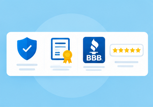
Strangers are about to carry someone’s whole life in boxes.
That’s a big ask.
So, trust has to show up fast, not after three page scrolls. Put credentials near the top of the page:
| Trust Signal | Reason? |
| USDOT number & Licensing details | Proves you’re a licensed, legitimate mover |
| Insurance details | Shows their belongings are covered if something goes wrong |
| BBB rating | Gives a third-party stamp of approval |
| Years in business | Signals stability over a brand-new, untested company |
Keep the proof easy to scan. Small trust badges can sit near quote buttons and contact details.
Every visitor typically has one question in mind: “Can this company be trusted with my stuff?”
Those trust signals remove that doubt before the first call. Potential customers feel safer choosing your company, which can lead to more completed bookings.
3. Local Service Area Pages
One generic “we move things” page rarely ranks and converts.
Build separate pages for each city or neighborhood you serve. Mention local landmarks, common building types, highways, moving routes, and pricing that fits that specific area.
Answer local questions directly. Add FAQs about travel fees, parking, timing, and service areas on each page. Keep the questions and answers relevant to the areas.
City-specific pages on your website connect your moving services with customers searching in their area. The details make your company feel familiar before the first call.
Strong local relevance can
- Bring better leads and
- Turn more searches into booked moves
4. Clear Pricing Breakdown
Hidden fees are the top fear in this industry.
People have heard the stories about a $400 quote turning into $1,200 on move day. This makes them doubt any company.
So, spell out how your pricing actually works. Explain your pricing model like-
| Pricing Factor | What to Explain |
| Hourly vs. flat rate | Which one applies to their move, and why |
| What’s included | Everything covered in the base price |
| Common add-ons | Extra charges for stairs, heavy items, or packing supplies |
Break down common costs. Explain labor, truck fees, mileage, packing, storage, and special handling. Mention possible extra charges. For instance, stairs, long carries, bulky furniture, and difficult parking can affect final prices.
Place pricing near quotes on your website. That way, visitors can understand costs before they request a detailed estimate.
Clear pricing builds trust fast. Customers who understand your pricing feel confident booking with you. That trust can win the job over a similarly-rated competitor.
5. Real Customer Reviews

A row of five-star icons alone doesn’t convince anyone anymore.
People want to read a real story with a name and a photo attached. So, avoid fake-looking testimonials. Real names, dates, photos, and source links can make customer feedback easier to trust.
Pull actual Google or Yelp reviews straight onto your site, with details about the move itself. This can provide stronger proof than anonymous website testimonials.
Try to show detailed reviews and ensure those are recent. Fresh reviews help visitors understand your current service quality.
Testimonials help show people what customers experienced during actual moves. That social proof reduces hesitation and gives visitors another reason to book your team.
6. Mobile Booking Flow
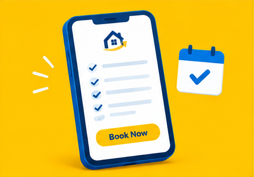
Build your website design for thumbs first.
Most moving searches happen on a phone, often while someone is mid-panic and surrounded by half-packed boxes. If your quote form is hard to tap or takes five screens to finish, people give up.
A mobile-friendly booking flow needs:
- Thumb-sized buttons, easy to tap without zooming in
- Short forms, with only the must-have fields on screen at once
- Fast load times, within 2 seconds so nothing stalls mid-form
- Easy date pickers, dropdowns, and address suggestions
- Clean layouts that keep booking options visible
- Simple menus that reduce unnecessary mobile clutter
Test every step of your booking flow and the entire journey on a real phone. Watch mobile behavior closely.
Mobile-friendly moving company websites make quotes easier to request. This can prevent abandoned forms and create more completed bookings.
7. Visible Contact Options
Not every visitor wants to fill out a form.
Some want to call right now, text a quick question, or chat with a real person. Keep these visible on every page:
- A sticky phone number, always in view while scrolling
- A click-to-call button, so mobile visitors tap once
- A live chat widget, for quick questions before a call
- A form field, for researchers
Place the number in the header, contact page, and service pages.
These options help you catch people ready to book right now. Don’t hide them; otherwise, visitors will leave.
Easy access to calls, texts, and chat helps with quick conversion. It can capture those visitors before they contact another mover.
8. Strong Service CTAs
A plain “Learn More” button wastes good space on the page.
Use action words that tell people exactly what happens next, like
- “Get My Free Quote” or
- “Book My Move Today”
Place one after every trust-building section, specifically near the top and throughout longer pages. Keep booking actions visible.
Match buttons with page intent. A storage page could use “Check Storage Options.”
Create a clear path forward. Each section should move visitors closer to calling, quoting, or booking.
Good timing makes CTAs stronger. Place one right after your reviews section, when visitors feel most convinced. That’s the moment a click turns into a booking.
9. Fast Page Speed
Make every second count.
None of the other eight elements help if your website takes six seconds to load. People searching for movers are usually in a hurry, often mid-move or mid-crisis.
So, aim for a load time under three seconds on both desktop and mobile. Pages should become usable quickly, even on slower mobile connections. Here are some tricks to make the site faster-
- Compress large images first. Moving trucks and crew photos can become heavy website files.
- Reduce unnecessary website scripts. Extra tools can slow pages without helping customers book.
- Keep forms lightweight. A quote form should load quickly when customers decide to use it.
Check mobile speed regularly. Watch real performance data. Fix slow pages quickly.
Quick pages help customers reach your quote and booking options sooner. A faster site can keep impatient visitors from leaving before they contact your company.
3 Extra Website Design Elements Most Movers Skip
Interactive Move Planner
Make the moving website user experience better.
Add a move planner that walks visitors through their own move before they even talk to sales. Visitors answer a few quick questions, such as:
- Home size
- Distance of the move
- Extra services needed, like packing or storage
The tool then suggests the right services and a clear next step.
This can turn a passive visitor into an active planner. It also builds momentum toward booking. That way, your team gets a head start on every call.
Live Availability Calendar
Don’t make people call to ask.
Instead, show real open dates right on the website. Visitors can see:
- Open dates, ready to book
- Busy periods, still open but filling up
- Full days, already booked
This cuts down the back-and-forth calls that slow down bookings.
A calendar also creates a bit of natural urgency as good dates run out. Customers book faster when they can see the calendar filling up in real time.
Moving Crew Profiles
People want to know who’s walking into their home with their furniture.
Show a simple profile for each crew member, with:
- A real photo
- Their name
- Experience and any training completed
This adds a human face to a service that can otherwise feel impersonal.
A crew profile page turns a faceless truck into a team customers recognize. That small human touch builds trust from the very start.
Website Design Mistakes That Kill Conversions
| Mistake | Consequence | Fix |
| Long quote forms | Visitors abandon the form before finishing | Ask basic details first, collect extra info later |
| Hidden contact details | Ready-to-book visitors can’t find a phone number | Keep phone, text, and booking links visible on every page |
| Weak mobile experience | Mobile visitors leave before requesting a quote | Use thumb-friendly buttons and test every step on a phone |
| Unclear service info | Visitors can’t tell if the company fits their needs | Write clear service sections with pricing factors spelled out |
| Too many distractions | Pop-ups and banners pull focus from booking | Keep each page focused on one clear next step |
Track Website Performance With 7 Metrics
1. Quote Form Starts
Tracks how many visitors begin filling out your quote form.
Check this number weekly against your total site traffic. A high number shows your CTAs and pricing hook are working. A low number often points to weak buttons or unclear offers.
2. Quote Form Completion
Shows the percentage of visitors who finish the form they started.
Compare it against your form starts to spot the gap. A big drop between the two usually means the form is too long or asks for too much upfront.
3. Booking Conversion Rate
The percentage of total visitors who complete an actual booking.
Break this number down by landing page, service page, and device type. This page-by-page view shows exactly which content is doing the heavy lifting.
Learn 10 Moving Company Marketing Strategies for increasing leads.
4. Click-To-Call Rate
Tracks how often visitors tap your phone number rather than filling out a form.
Set this up through your call tracking or analytics tool. A strong click-to-call rate shows your contact options are easy to spot and use.
5. Mobile Conversion Rate
Compares how mobile visitors convert against desktop visitors.
Pull this split from your analytics dashboard every month. A large gap between the two almost always points to mobile web design or form problems.
6. Service Page Conversions
Tracks quotes and bookings generated from each service page.
Tag each page separately in your analytics setup. This shows which services actually turn searches into real leads.
7. Page Exit Rate
Shows exactly where visitors leave your site before taking action.
Watch this closely on quote pages and service pages especially. A high exit rate there can point to confusing content, weak CTAs, or slow load times.
Frequently Asked Questions (FAQs)
A moving company website can cost $2,000 to $15,000+. Pricing depends on page count, custom tools, booking features, integrations, copywriting, and ongoing website support.
A basic moving website can take 4-8 weeks to build. Larger sites with quote tools, calendars, custom pages, and integrations can take longer.
A strong moving website should include Home, About, Services, Service Areas, Pricing, Reviews, Contact, and Quote pages. Add dedicated pages for major moving services.
MonsterClaw specializes in digital marketing for moving companies. Its team can create conversion-focused websites that support Local SEO, lead generation, quote requests, and booked moves.


